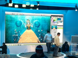
The Adobe User community is in a bit of a tizzy over the new subscription plan for Photoshop CC. If you missed the debate...users must now pay a monthly fee to use Photoshop. You no longer own your software. You own the right to use it when Adobe says you can use it.
There are a lot of cool new features for photographers, but for illustrators, the Brush Panel is a bit of a disappointment. Adobe really has not done much with it in years so I was hoping to be wowed with this upgrade. Here are three new additions to the brush panel:
1. Brush Pose
Brush Pose lets users "achieve stylus-like effects and let you control the angle and position of the brush". (Fig 1) |
| Fig1 |
2. Build Up
In theory, Build Up sounds swell. It "Applies gradual tones to an image, simulating traditional airbrush techniques. The Airbrush option in the Brush panel corresponds to the Airbrush option in the options bar." (Fig 2)
 |
| Fig2 |
 |
| A. The Soft Round Brush with no Build-up applied. This is two strokes |
 |
| B.The Soft Round Brush with Build- up Applied. This is two strokes |
Do you see a difference? Perhaps I need to be sipping the Adobe CC Koolaide to see it.
3. Paper Contrast & Brightness inside Brush Texture
The ability to add pattern texture to your brush has been in Photoshop for some time now. In this version, they have stolen a trick from Painter (it's been in Painter for at least the last 4 versions) and now allow users to change the brightness and contrast of the pattern texture. Here is the new menu inside the Brush Panel's Texture option (Fig 3) |
| Fig 3 |
 |
| Contrast and Brightness set to 0 |
 |
| Brightness at 100% and Contrast to 0 |
 |
| Brightness at 0 and Contast at 100% |
Using Camera Raw
There are some features that were meant for photographers that I can see coming in handy for illustrators. For example, Camera Raw Filter now allows users to make nondestructive editing without actually having a Raw file. This is probably the biggest reason to upgrade, especially if you use Photoshop mainly to color correct your art. One tool that I really love is the Radial Filter tool inside Camera Raw. Its was designed to allow photographers to create vignettes, but I see it as a magic light correction tool.
The image below is from my next book and it is taken from a chapter on how to paint like Renoir using Corel Painter.
Renoir was a master of light, but in my image, the shadows are too dark on her face to really convey sunlight. I could paint over it or I could use Camera Raw to fix it quickly.
Here are the steps:
1. From the Menu bar select Filter/Camera Raw. This will open up the interface for Camera Raw
2. From the top menu select the option for Radial Filter (Fig 1)
 |
| Fig 1 |
3. Drag a selection around the area that you want to become your vignette. (Fig 2). You can move this vignette area to any spot on your image by selecting and dragging the red circle in the center.
 |
| Fig 2: By dragging anywhere on your image with the Radial Filter tool, you can create a vignette. |
4. In this case, I wanted the darker areas to be outside my selection area and the lighter area to be on the inside, so I clicked the Inside option. (Fig 3)
 |
| Fig 3 |
5. It is now blowing out my highlights too much so I need to adjust the exposure. I lowered it slightly and also increased the saturation. I then lowered the temperature a tad to remove some of the red. You can see the difference below is very slight, but it is noticeable.
The original image without any color correction. Her face is too dark and too warm.
The image corrected with the Camera Raw Radial FIlter. Her face is now lit with more light.
That is just one new feature. There are others that illustrators will benefit from. I will post more Photoshop CC tutorials later next week. Overall, if you use Photoshop to mostly paint, don't expect much. If you use it to color correct scanned or Corel Painter art, Photoshop CC might be worth the monthly fee.
If you are on CS5 or CS6, do you plan to upgrade? Would love to hear if you have used any of the new features in your work.


