Friday, December 12, 2008

A special Thanks to the KidzBookBuzz Blog Tour

I am a little late posting this, but a special thanks to everyone who participated in the KidzBookBuzz Blog tour for the release of my new book, The Raucous Royals. I especially enjoyed the fact that I found so many amazing blogs in the process.

Thank you to:
  1. The 160 Acre Woods

  2. All About Children’s Books

  3. Becky’s Book Reviews

  4. Cafe of Dreams

  5. Dolce Bellezza

  6. Fireside Musings

  7. The Friendly Book Nook

  8. Homeschool Buzz

  9. Hyperbole

  10. KidzBookBuzz.com

  11. Maw Books Blog

  12. Never Jam Today

  13. Quiverfull Family

  14. Reading is my Superpower

  15. Small World Reads

  16. SMS Book Reviews

I am going to post a link to some of the interviews over at The Raucous Royals Blog as soon as I get a chance.

Monday, November 17, 2008

One author's way of coping

Author Brad Meltzer will definitely peak your interest with his video on bad book reviews. I prefer eating a gallon of ice cream.

Thursday, November 13, 2008

Stealing Caravaggio

Sorry for missing last month’s post. I have been caught up working on my next book, I feel better with a frog in my throat, the final cover for the fantastic Houdini Series by Thomas Lalicki (shown here) and lastly my new history blog ....which I swear you will love even if you hate history.

I do have a really quick Painter tutorial and it’s one that I think everyone can use.

Painter has many hidden tricks that go unused, but one of my favorite is right in the Color Sets palette. Have you ever opened that sketch to be painted and been stuck as to what color palette to use? Well, if you are really lazy (like me) you can steal colors from the masters. For this tutorial, we are going to steal from Caravaggio.

1. If you don’t see the Color Sets palette – select WINDOW/ COLOR PALETTES / COLOR SET. The Color Set looks like a bunch of swatches similar to how Photoshop displays them.
  1. 2. Open an image up that you feel has a good range of color or the correct colors.
  2. 3. Go to the Color Set , Click on the little arrow to the right, Select “New Color Set from Image”

Painter will now make a color set from that image. That’s it. Paint with Caravaggio’s colors.

This color set might not have every color that you want. You can also add colors to your color set by clicking on the little color swatch add symbol at the bottom (circled in red here)

You can also mix your own colors up in the mixer pad and then again click on the little arrow to the right and select “ New Color Set from Mixer Pad”

Let me know if this is helpful. And if you don’t have Painter, then just download a 30 day-trial to check it out from the banner on the right.

Thursday, September 25, 2008

Imagelexia. How to draw with a misplaced thumb

Reversing numbers is a peculiarity we all share. Even reversing letters happens sometimes in our addled brains. If we do it often, we have a fancy name for this phenomenon…dyslexia. But what about artists who reverse images in their mind?

Lets call it imagelexia because it makes me feel much better to give a name to my mental defects. I don’t know how it happens, but every time I draw hands, toes…even faces they get reversed on paper. (In my head, they looked perfectly normal.) Luckily, my critique group has caught COUNTLESS paintings of poor people with their thumb on the wrong side of their hand. My image of the Changs for Who Put the B in the Ballyhoo? had gone through proofing and legal and all the other smart people who are supposed to catch mistakes, but no one had caught the reversed thumb except my faithful critique group.

One of my critique group members, Penny Weber always draws expressive, beautiful hands. She has inspired me to do better. No more excuses. No more laziness. I vow to improve my hands. (Toes are another matter because feet really gross me out) And you faithful readers of this blog (all 3 of you) should also share in my quest for better hands…

Here are some tools:

1. Here is a website with 206 images of hands in art. Pure hand inspiration.

2. Drawing Dynamic Hands by Burne Hogarth
This is one of my favorite books for drawing hands in motion.

3. Here is a short video from Matt's Illustration demonstrating how to draw better hands. Matt advises to draw the thumb last. Makes sense.

Let me know if you have other tools to get those digits looking pretty.

Quick Announcement...
I have been greatly neglecting this blog, but I do have some tutorials planned for the next couple of months. In the meantime, please stop by the Raucous Royals blog and get your weekly dose of rumors, scandals and facinating royalty. Your feedback is always appreciated.

Wednesday, September 17, 2008

Your Pocket Watch is Ticking....

2 more days to head over to Scandalous Women and enter to win a copy of The Raucous Royals. Entering is as easy as losing your head in Henry VIII's court. Just comment on the Jane Boleyn post and...Voila you're in.

Thursday, September 04, 2008

Win a FREE copy of the Raucous Royals!

Throw on your petticoat, grab your parasol, button up your britches and rush on over to Picture Book Junkies to enter to win a FREE signed copy of The Raucous Royals.

Wednesday, August 20, 2008

Bestill My Beating Heart...

The Ballyhoo has been “hearted” by the amazing, death-defying talents of krisztina maros at sketch pause.

Here are my 7 blogs that may change your life in no particular order

1. Barbara Johansen Newman’s always feisty blog – Cats and Jammers Studio

2. Author and blogger extrordinaire Cynthia Leitich Smith whose recent vampire book, Tantalize and spooky blog will leave your hair permanently standing on air.

3. Linda Silvestri whose blog has received countless blogging awards and still deserves 10 more for making me laugh on a regular basis.

4 & 5. Kathy Weller and Monica Lee for making me want to tap into to my innocent, whimsical and far less darker, vodka-drinking child.

6. The World Famous Circus Star, Adam Rex whose work makes me as giddy as school girl with a Jonas Brothers crush.

7. And last but not least....the best kept secret in blogging history is Don's American miniature portrait blog and European Miniature Portrait Blog whose postings are a treasure trove for any illustrator or writer researching historical hairstyles and costumes.
The rules for this award-takeaway are:
1. The winner can put the logo on their blog
2. Link the person you received your award from
3. Nominate at least 7 other blogs
4. Put links of those blogs on yours
5. Leave a message on the nominee's blog letting them know about their award

Thursday, August 07, 2008

Ballyhooed Talent


The very talented Brian Demeter has some new original paintings for sale. His art always sells out fast so hurry on over.

I just got myself this ADORABLE frog for my daughter's room.
© 2008 Brian Demeter


Tuesday, July 29, 2008

Illustration Friday: Canned

I have not posted a circus image in a while so I couldn't resist showing an illustration of the man who truly knew how to get out of a can. This picture is from Who Put the B in the Ballyhoo? and depicts Houdini's Chinese Water Torture Cell. Read more about other escapes from tight places like the infamous Milk Can Escape.

Sunday, July 27, 2008

Raucous Royals Book Trailer

Vote for your favorite book trailer.

Serious and Dramatic Version with Bad Accent


More Playful Version with Bad Accent:

Friday, July 25, 2008

Sketch Theatre

Visit Sketch Theatre to see artists create their illustrations under a high speed camera. I thought it was especially interesting that Michael Broom creates this spooky character UP SIDE DOWN.

Tuesday, July 15, 2008

Some of my Favorite Art Things

Raindrops on roses and whiskers on kittens

Bright copper kettles and warm woolen mittens

Brown paper packages tied up with strings

These are a few of my favorite things

La La La. My daughter has a music box that plays this song. She recently has decided that sleep is overrated and the purpose of a crib is to repeatedly bang your head against its wooden sides. So I have been playing this song constantly in the hopes of brainwashing her into believing Julie Andrews is just over the hilltop beckoning her into naptime. I have really only succeeded in getting this song stuck in my head all day long.

Hopefully, this list of my favorite art things can reprogram my brain…

Wacom Cintiq Tablet
I have been using the Cintiq since 2005 and I don’t know how I ever got by without it. If you are a digital artist, it really will change your life. ok I might be being a bit dramatic. It might not change your life, but it will change the way you paint. Wacom tablets are ok but nothing beats painting directly on the screen. I found my art started to look less digital after I made the switch. And if you are worried about the cost then you can always justify it by remembering how much faster you can paint on the screen.

Crumble, Crackle and Burn: 60 Stunning Textures for Design & Illustration
by Von Glitschka
Yes, I know we all are getting a little sick of the texture overload on graphics. But you know clients tend to be behind the design curve so someone is bound to ask you to put a little texture in your art. With this book you can tell your clients that you slaved away for hours and hours taking photo shoots of perfectly weathered concrete and the bark of a 300 year old birch tree when all you really did was drag and drop from Crumble, Crackle and Burn’s collection of scanned textures.

Facial Expressions Babies to Teens and Facial Expressions by Mark Simon
These two books are a must have for anyone trying to capture that perfect 10- year old supercilious disdain. Maybe over-the-top fear is what you are after. Mark Simon’s book has you covered with every possible facial expression. He gives different rotated views of the same character too so you can illustrate a wide spectrum of facial expressions using the same faces.

Corel Painter Magazine
I have heard from many artists that the reason they don’t use Painter is because they find it too complicated. Come now. The real reason is that we are a bunch of die-hard, Photoshop dogs afraid to learn some new tricks. Learning a new program is always tough and those software textbooks are b o r I n g. Corel Painter Magazine makes it easy to pick up tips and tricks by focusing on a different brush tool in Painter each month. They also offer tons of inspirational paintings done by leading Painter artists.

Marie Antoinette Action Figure with Removable Head
Everyone should have at least one toy in their office that counts as a stress reliever. Mine is my Marie Antoinette action figure. With just a push of a button….off pops her head. Mad at a client? Marie had suddenly morphed into that dreaded client and…dang, “oh dear...where did my head go? I can’t make stupid comments without my head.”

Boxing Gloves, punching bags, stress balls, dart boards can also work wonders.

That’s all I can think of for now. Feel free to share some of your favorite art things or any advice for sleep-deprived new parents.

Saturday, June 21, 2008

Illustration Friday: Hoarding Cats and Frizz

I started this painting last week and I thought I would show it for this week’s illustration Friday along with a new tutorial. It is for a new book I am working on (more on that later)

On to the tutorial…

This Heat is Killing My Hair
This week’s tutorial is all about frizz control. When I originally painted this medieval witch she was much more androgynous looking because she lacked any hair. The very talented Karen Lee and Deborah Freedman suggested that I give her a wiry do peaking out from under her cap. Here is what she looked like bald. (right) I think the hair makes her look MUCH prettier.

It just so happens that frizzy hair is painter’s specialty. Here is a close up of the witch’s hair.

How to create your own frizzy mane.

Select the realBristle Brushes – Real Round as a base brush.
Select Window/Show Brush Creator. (The brush creator allows you to adjust all the controls of your brush in one place and gives you a pad to try out your brush as you tinker.)


Frizzy brush settings:

Size: 19.8
Min Size: 28%

Feature: 7.0 – this setting is important because it will change the thickness of your hair. A higher setting will spread the hairs out more and a lower setting will clump the hairs together and give you smoother hair.

Random: Something higher then 1.5. – This will control the amount of frizz. The higher the setting – the more frizz.

Once you have the brush giving you just the right amount of kinky wildness then save it for a later use. You can do this by selecting “Save Variant” where your brush is located. Name it something useful like “horse tail” so you will remember what it looks like.

You can use frizzy brushes for not just hair, but also to give your paintings an erratic, full of energy, texture. For example, I increased both the Feature and the Random setting and painted the night sky with this brush to give some crazy looking fog to the sky. (right) I think this brush has some tension to it. It’s not the kind of brush you would want to use when painting a sweet meadow scene of hopping bunnies, but it works for a graveyard.

You can pretty much make any kind of hair brush you want with a little experimentation. A frizzy brush is great for animals with wiry fur too. I used a frizzy brush to make the stray pieces of hair and thicker parts of the bearded lady's beard (in header image above).

Hope everyone is keeping their frizz in control this summer. Comment or email me if you have questions.

Monday, June 02, 2008

Ballyhooed Gadget – Amazon Kindle

A few weeks ago, my husband gave me an Amazon Kindle to amuse me during my recoup after surgery. When I first held this strange, paperback-sized device my immediate reaction was – “why would I want to read a book on an electronic device followed by…you spent what on that thing ????”

Honestly, I am usually what the marketing folks call an “early adapter”, but NOT when it comes to books. I love the smell of books and the beautifully, solid feel of a book in my hands. I get lightheaded when I see a book with embossing, a well placed varnish or anything shiny. All of these things are part of the sacred reading experience and there was no way I was giving them up. I was so wrong.

Reading for the page-turning impaired.
First off, I thought that it was going to be like reading on a screen which my senior eyes just can’t take any more. But the kindle looks like paper…sort of a grayish paper. You turn the pages by hitting the next or previous button. Super easy. I know you might be thinking….you’re too lazy to turn pages? Trust me. Buttons are a tremendous asset if you ever find yourself stuck in bed, drooling on yourself, with your arm encased in a refrigerated sling. And really it’s not just useful for one-armed gimps like me. Let’s say you are one of those poor slobs that ride the train every day to get to your soulless job trapped in a cubicle. Well, now your soulless trip does not need to involve elbowing your neighbor to read your book. You can even read standing up with one sweaty hand on the seat handles and the other clutching your kindle. And best of all, your neighbor will never know you are reading that biography on your favorite Golden Girl, Bea Arthur. It is the ultimate private reading experience.

Reading for the Psychologically impaired
Aside from the joy of buttons, you can also take notes and annotations easily as you read. In my pre-Kindle days, I would tag pages with sticky notes or if I was really feeling frisky….write on the book. (gasp) Writing on a book gives me painful flashbacks of Catholic school in the third grade. Even a harmless underline could earn you the stern disapproval of the nuns. To this day, I have serious Catholic guilt when it comes to taking notes on a book. With my kindle, I just type my notes on the key pad and they are all saved within each book.

Reading for the Visually Impaired
For those of you that walk around with a cane and are known to occasionally mutter how you remember when gas cost a dollar, then you will really appreciate the text options in the Kindle. With just a click of the button, you can increase or decrease the size of your type. Voila. No more hurt eyes.

Reading for the Drug Impaired
After you get used to the Kindle’s features, the device becomes as transparent as any other method of reading. Several times, I reached for the corner of my Kindle to turn the page instead of using the buttons. I had actually forgotten that I was reading a book on a device. (ok I admit that I was drugged up on pain killers at the time, but I wouldn’t be surprised if other people do the same thing).

Reading for People with Really Big Thumbs
My one complaint with the Kindle is that the buttons on the sides are way too long. Amazon’s product focus group must have been a room full of big handed chimpanzees because there is no way that anyone needs buttons that large. At first, I kept accidentally hitting the next and previous screen buttons because they are just so honking big. Amazon needs to rethink their target market’s average thumb size for V2 of the Kindle.

But other than the giant buttons, I am really enjoying my new toy. Now if only I could get it to have that new book smell.

Thursday, May 15, 2008

Painter's Digital Watercolors

In this tutorial, I am going to cover the basics of using Painter’s digital watercolor brushes using last week’s experiment. I have to say up front that if you are looking for watercolor inspiration then this is not the place. I find watercolors one of the hardest mediums to work in and probably my least favorite. But people who make the switch to digital painting usually like Painter’s watercolor brushes the best.

Digital watercolors do allow you to experiment in a way that allows more freedom than traditional watercolor medium. (Those of you that have worked in watercolors know how unforgiving it can be.) The digital medium works the same as the traditional medium so I am not going to go into any watercolor techniques.

First we start with a sketch. Watercolors are the only medium where I will start on a white piece of paper. I find this utterly terrifying because you cannot set a cool or warm mood with the color of your paper. But just like in traditional watercolor, the brightness of the paper becomes your base color.

There are two types of watercolor brushes in Painter. There are the regular old “watercolor brushes” that have been in Painter for ages and there are the “Digital Watercolor brushes”. The watercolor brushes are better for sweeping in washes of color in backgrounds, but you will need tons of memory to use these without grinding your machine to a halt. The digital watercolor brushes work much more efficiently. You can select one of the digital watercolor brushes from the brush menu by clicking on the small arrow next to the brush.

Next you want to choose a kind of digital watercolor brush and customize it to your needs. I prefer to start with the “Wash Brush.” The real magic in this brush is controlling the “Wet Fringe” and “Diffusion.” In this sample, the left doodle has a Wet Fringe of 100% with a 0 Diffusion. You can see that this creates a brush strokes that goes on wetter because you can really see the color accumulating on the stroke edges. On the right the Diffusion is kept at 0 and the Wet Fringe is 0. This creates a smoother almost marker feel. To me, it looks more like what you can get out of Photoshop which I personally think looks more "digital."

In this next example, the Wet Fringe is kept at 100% and the Diffusion is put at 20. This creates a very watery fluid brush which might not be the right brush for objects, but would look fabulous as a watery backgrounds.

Another interesting brush is the “Wet Eraser” under the same brush grouping. This brush allows you to easily correct your mistakes with literally a wet erase. Something that is difficult to do with traditional watercolors. (Note: the wet eraser only works on layers. Once you drop your layer down you will want to go back to the regular eraser.)


At this point, the painting just has some light washes. I like a little texture so I always go over my watercolor paintings with some pastels using different textured paper. And that is what you can see in the final.

Another tip: Use lots of layers with watercolors. You can create a new layer in the same way that you do in photoshop by clicking on the small right triangle and selecting “new layer.” If you paint each wash on a seperate layer then you can lower the opacity as you go to and slowly build color. I drop the layer once I get it looking how I want it. (You drop the layer by clicking on the arrow to the right and selecting “Drop.” The drop is the equivalent to the "merge down" command in Photoshop)

I will cover Painter's pastel brush in another tutorial. I also plan to cover painting with a watercolor brush in Photoshop. The steps are a little less intuitive, but it can be done. Let me know if there is something in particular that you would be interested in seeing.

Saturday, May 10, 2008

Illustration Friday: Electricity

For a limited time only! Get your Dr. Horne's Electric Belt. (Batteries sold separately).

btw, I will have a new tutorial up next week. I dislocated my shoulder while wearing my new vibrating belt. Long posts are a bit tricky right now.

Sunday, May 04, 2008

Illustration Friday: Seeds

With this week's topic, I had a childhood memory of how I used to always wonder where the seeds from a flower would plant themselves when you blew them into the wind. (I know...totally corny!) I am sure my neighbors could have done without me blowing weeds into their yard.

Here is a quick experimentation with Painter's digital watercolor brushes and Hard Pastel on Rice paper. I have not used Painter's watercolors in awhile and I had forgotten how wonderful the brushes are for showing fluid movement. (the seeds blowing out of the dandelion are the "Spatter Water" brush.) When I worked traditonally, I could never control my spatters and would always end up with a muddy mess.


If people like this experimentation then maybe I will do a tutorial next on painter's watercolor and pastels tools. Let me know if you are interested...

Friday, April 18, 2008

A Bad Brow Job

As with most people, I love the image of Mona Lisa and her enigmatic smile. But it has always bugged me that the woman is missing eyebrows. I love a good full brow as seen in my header image above. As a child, I used to draw brows on Mona Lisa’s face (still doing it!) Later, I discovered that plucking eyebrows was not in fashion until years after Mona Lisa was painted and I was left wondering…where did her eyebrows go?

Now the mystery of the missing brow line is finally solved. Pascal Cotte, a French engineer and inventor, used a high-definition camera to discover the lost hair in the famous painting. Turns out that good old Mona got over plucked by either the ravages of time or a few overeager attempts to restore her image. You can read more about it here.

Sunday, April 13, 2008

Painting with Style

In this tutorial, I am going to show how to use Photoshop styles to create depth and as a base for your paintings. Styles sort of get a bad rap because most designers and illustrators think of those glass buttons that the mac folks made so popular a few years ago. I remember every client was asking for “glass buttons” during that time and styles started to make me peevish too. But they do have their uses. Photoshop styles helped me whip out the name plate in last week’s tutorial without much fuss.

Here are the steps

1. Select the rounded rectangle tool from the Photoshop tool palette and set the radius to about 10. Pick some sort of goldish color. Click and drag to make a square with rounded corners.

figure 1
2. Next, we are going to create rounded circles jetting out from the square. Select the eclipse tool in the tool bar. We don’t need to create a separate shape here. It will be much easier to edit as one path. So to do this we will go to the top bar in photoshop and select the compound path option (figure 1)

figure 2


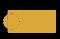
3. Next, hold down the shift key and draw a circle to the left side of our square (figure 2). (holding the shift key constrains the proportions of the circle)

4. Now we obviously want both sides to have the same size circles so we will select the path selection tool (figure 3) and select the circle that we already drew.


figure 3
Hold down first the alt key and then the shift and drag the left circle over to the right.

figure 4


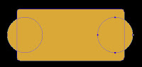
(The alt key makes a duplicate and the shift key makes sure that the second circle is aligned with the first). You will now have one fully editable shape. (figure 4)


5. Now the fun part. We can apply styles to create the depth. Hit the small “f” key at the bottom of your layers palate or double click on the right side of the layer. This opens up the styles palate. Styles are something that you really need to play around with to get the most out of them but I used the following settings for the plate:

Check the following Layer Styles:

figure 5
Drop Shadow:
Opacity 51, set to multiply, distance: 13 Size: 8
Bevel and Emboss: (see figure 5)
Satin: ( see figure 6)
Color Overlay :
Set to orange, Normal blend mode, 100%


figure 6


If you want a rougher metal texture then you may want to play around with the pattern styles too.

And when you are done, in the styles palette, click the small right button and select “save styles” (right). Now you can use it again for creating more metal plates.

Monday, April 07, 2008

New Blog and Site


I have a new blog and site up on gossip and rumors surrounding royal rulers. Check it out and let me know what you think:

The Raucous Royals and the Raucous Blog

Saturday, March 29, 2008

Illustration Friday: Homage


This week’s illustration Friday topic of "homage" could apply to basically anything; music, food, cute animals…dirty socks (I’ve got my growing piles of laundry on my mind). This week I thought I would post a tutorial using Adobe Illustrator because I have not covered any tips in this program.


Elizabethan Ruffs

My homage will be to Elizabethan ruffs. For those of you that might not be familiar with the era, Elizabethan ruffs are the massive, wheel-like starched collars that required thousands of pins and a lot of patience to create. One of the more elaborate decorative collars can be seen in the famous Armada portrait. (left).


Elizabethan ruffs often required as much as 8 yards of fabric to create. The material was heavily starched and the folds were created with a hot iron called a poking stick, similar to modern curling irons. Figure A. would be heated in the fire and Figure B. would be warmed inside Figure A. Next, the poking stick would be placed inside the starched folds (figure C). The more elaborate ruffs were decorated with lace and bead work and also supported with an object called a Supportasses (Fig. 720). With 8 yards of heavily starched fabric, ruffs must have been extremely heavy. And we complain about high heels!

For my next book, The Raucous Royals (due out in September), I wanted to portray Elizabeth in a similar wardrobe as the Armada portrait. This picture introduces the rumor that Mary Queen of Scots plotted to kill her cousin Elizabeth. Elizabeth needed to look regal, but there is just no way that I was going to paint in all that intricate detail in the lace. For fine details like this Elizabethan collar, Adobe Illustrator can make dressing the queen a cinch.

Here are the steps:
  1. I opened Adobe Illustrator and created a single section of the lace work using repetitive shapes and line work. This part is a bit time consuming, but not half as laborious as painting in her whole collar with a really thin brush. Plus, my hand is not that steady and I did want some uniformity in the design.


  2. Once I created one section of her collar, I dragged the entire shape into the brush palate. I selected “pattern brush” for the type of brush. Name your new brush something that makes sense. You now have a new brush created in your brush library.

  3. Next, I created a circle that would roughly be the circumference of Elizabeth’s collar.

  4. Now the magic- select your circle and apple the newly created brush pattern by simply selecting it in the brush library. You should have something that looks like this:


  5. Now select our ruff and hit copy (CTRL/CMD + C) and open Photoshop. We paste the ruff into Photoshop (CTRL/CMD + V) and select “smart object” (we want this to be a smart object so that we can resize it without loosing quality and also have the ability to edit it in the future.)


  6. The next step is to mask out the center of the lace so that it is under the main ruff and encircles her head.

  7. The last step is to apply a “Smart Sharpen” filter under the menu Filter/Sharpen/Smart Sharpen. Lower your fade amount in the highlight area. This last step is in important to force the white and black details to a higher contrast. We need to do this in any shape that is as intricate as this or the pattern will be too blurry.

    Note: We could have also distorted the collar to be smaller in the back and larger in the front, but I liked the flatness of the design in this case.
Voila…an intricate lace collar for Elizabeth that would have surely made Mary jealous.

Next week, we reach the pinnacle of pure laziness. I am going to demonstrate how to use the style palate in Photoshop to avoid doing any painting. I used styles to create the gold marker plates. It took 60 seconds instead of hours painting metal reflections and shadows.


Source:
Norris, Herbert. Tudor Costume and Fashion, Dover Publications, Inc. New York, 1997
Picard, Liza. Elizabeth's London, St. Martin's Griffin, New York, 2003