 I have been trying to get in the habit of posting a digital painting or writing tip each week. But what is that saying about the road to hell….something about it paved with good intentions? Every week might just be a little too ambitious with my schedule.
So here is the tip for this week…
Many of you have probably already upgraded to the new Painter X And if you have not then here is one of my favorite new features. It is called the Divine Proportion tool.
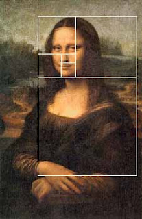
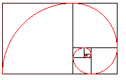 Divine proportion in art is sometimes referred to as the Golden Proportion, Golden Number or if you are a real geek, the Fibonacci Series. The golden number is basically 1.6180339887 otherwise known as phi. Inside of the big rectangle is another rectangle that has an exact ratio of 1:1.618. Inside of that rectangle is another rectangle with a perfect ratio of 1:1.618. Probably the most famous example of The Golden Ratio used in art is Leonardo's Mona Lisa The Golden Ratio can be found in Mona Lisa’s enigmatic face. Shown here:
I have always been fascinated with the idea of Math in art and always try to be aware of planning a composition so that that main action does not fall into a dead zone. The example above is the art I created for the 2007 SCBWI Publication Guide. (available to members at www.scbwi.org) Because this art was created to fit into a small space, I am going to use the divine proportion tool from edge to edge.
Here are the steps:
Step 1: Go to Window/Show Divine Proportion. The tool’s interface with look like this:
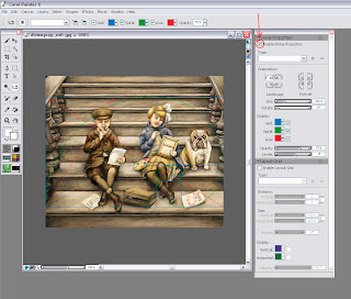 Step 2: Check the box for “Enable Divine Proportion” at the very top.
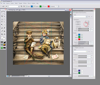
Step 3: You can now alter your Divine Proportion tool to match your composition. In this example, I selected a vertical orientation for my divine proportion because I want the eye to be carried up the stairs but the focus to be on the little girl’s expression. (In my original sketch she did not fall in this location so I moved her.
Here is an example with the image screened back so you can better see it:
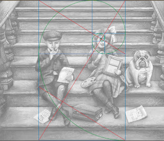
You can also change the rotation and the scale of the divine proportion by tinkering with the controls below the orientation. In most cases, you will not want your divine proportion to go from edge to edge. This image is postcard size and there is not a lot of empty space so the viewer takes the whole thing in at once. In a larger painting this will not be the case.
So of course, I started to wonder if other artists use Divine Proportion in their art. Here is an illustration from the super talented Loren Long and a good example of when you would move the Divine proportion tool.
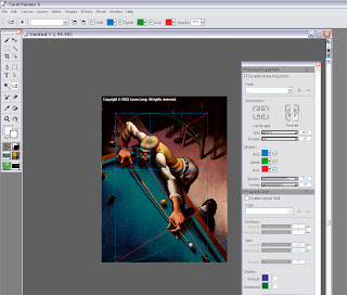
In this painting the viewer would not take in the dark space in the back. It is intentional dead space – sort of like an area for the viewer to rest before they take in the main action. In music, we would call it the build up. So if you move the Divine Proportion tool to encompass only the man then you will see that it falls perfectly into a golden ration.
You move the Divine Proportion tool by selecting it in your main tool bar. It looks like this:
 When you move your cursor over your painting, your cursor will turn into a hand so you can position your Divine Proportion guides manually.
In Loren's painting, the first main rectangle encompasses the sweeping motion. The second rectangle encompasses the perfect hand to elbow to face ratio, and then the smaller rectangles encompass the concentrated look on the man’s face.
The composition is perfectly planed. Now let’s take a moment to hate him, but I suspect that Loren is not conscientiously aware of the math behind his art. Most artists do this naturally. For the rest of us….there’s the Divine Proportion tool. Loren has a New Book out now that is stunning as always.
But if all of this makes your head hurt then there is also the good old rule of thirds to go by. In the box below the Divine Proportion tool there is an option to turn on a layout grid. The layout grid will at least tell you if your main action is falling into the thirds of your painting. You can find this option here:
If you would like to learn more about how Math works in art then I recommend Rhythmic Form in Art by Irma A. Richter
I hope this tips help. If anyone is interested in how to do the same steps in Photoshop (not quite as easy) then please comment below and I will make that next week’s tutorial.

5 comments:
Carlyn, your piece is simply divine and the tutorial is facinating. Thanks, I'll be looking for the divine in everything from now on.
Karen
Hi Carlyn,
Thanks for this tip! I have to say that I still ave not quite wrapped my head around the Divine Proportion tool, but this post goes a long way towards helping me to do that.
I am now working with Painter X and figuring out how it all works. It was cool to hear how you work on one piece in both Painter X and PS. I am trying to figure out a workflow for myself which utilizes both - - or, if it even makes sense for me to integrate PS at all. Only time will tell!
Hope you are doing very well!!
Take care,
Kathy
This is it! If some of you rally need some help with essya adn homerok yo canask this guys for help! Use this writing a personal statement for residency adnd be sure that this guys know how to do it! Good luck ad have fun! Enjoy!
Almost all large international companies invest heavily in market research, and if you are interested in this topic, then go to this site https://www.mageplaza.com/blog/what-is-market-research.html where you will learn what market research is and all that.
The excitement around the ballyhoo is undeniable! It’s all about staying on top of things, just like with applied science coursework service. Keeping up with deadlines and staying organized can make a huge difference in both areas, helping you succeed effortlessly.
Post a Comment