Saturday, June 02, 2007

Ballyhoo Tip of the week….ok maybe for the next few weeks

I have been trying to get in the habit of posting a digital painting or writing tip each week. But what is that saying about the road to hell….something about it paved with good intentions? Every week might just be a little too ambitious with my schedule.


So here is the tip for this week…

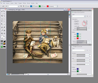
Many of you have probably already upgraded to the new Painter X And if you have not then here is one of my favorite new features. It is called the Divine Proportion tool.

Divine proportion in art is sometimes referred to as the Golden Proportion, Golden Number or if you are a real geek, the Fibonacci Series. The golden number is basically 1.6180339887 otherwise known as phi. Inside of the big rectangle is another rectangle that has an exact ratio of 1:1.618. Inside of that rectangle is another rectangle with a perfect ratio of 1:1.618. Probably the most famous example of The Golden Ratio used in art is Leonardo's Mona Lisa The Golden Ratio can be found in Mona Lisa’s enigmatic face. Shown here:

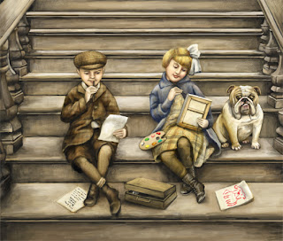
I have always been fascinated with the idea of Math in art and always try to be aware of planning a composition so that that main action does not fall into a dead zone. The example above is the art I created for the 2007 SCBWI Publication Guide. (available to members at www.scbwi.org) Because this art was created to fit into a small space, I am going to use the divine proportion tool from edge to edge.

Here are the steps:

Step 1: Go to Window/Show Divine Proportion. The tool’s interface with look like this:
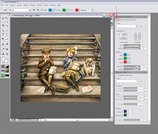

Step 2: Check the box for “Enable Divine Proportion” at the very top.

Step 3: You can now alter your Divine Proportion tool to match your composition. In this example, I selected a vertical orientation for my divine proportion because I want the eye to be carried up the stairs but the focus to be on the little girl’s expression. (In my original sketch she did not fall in this location so I moved her.

Here is an example with the image screened back so you can better see it:
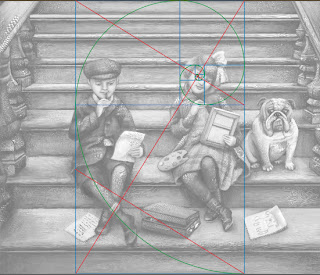

You can also change the rotation and the scale of the divine proportion by tinkering with the controls below the orientation. In most cases, you will not want your divine proportion to go from edge to edge. This image is postcard size and there is not a lot of empty space so the viewer takes the whole thing in at once. In a larger painting this will not be the case.

So of course, I started to wonder if other artists use Divine Proportion in their art. Here is an illustration from the super talented Loren Long and a good example of when you would move the Divine proportion tool.
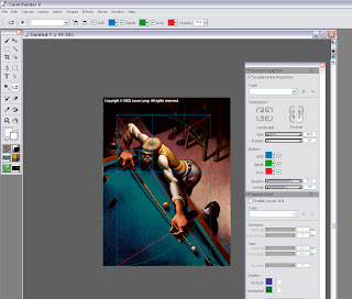
In this painting the viewer would not take in the dark space in the back. It is intentional dead space – sort of like an area for the viewer to rest before they take in the main action. In music, we would call it the build up. So if you move the Divine Proportion tool to encompass only the man then you will see that it falls perfectly into a golden ration.

You move the Divine Proportion tool by selecting it in your main tool bar. It looks like this: When you move your cursor over your painting, your cursor will turn into a hand so you can position your Divine Proportion guides manually.

In Loren's painting, the first main rectangle encompasses the sweeping motion. The second rectangle encompasses the perfect hand to elbow to face ratio, and then the smaller rectangles encompass the concentrated look on the man’s face.

The composition is perfectly planed. Now let’s take a moment to hate him, but I suspect that Loren is not conscientiously aware of the math behind his art. Most artists do this naturally. For the rest of us….there’s the Divine Proportion tool. Loren has a New Book out now that is stunning as always.

But if all of this makes your head hurt then there is also the good old rule of thirds to go by. In the box below the Divine Proportion tool there is an option to turn on a layout grid. The layout grid will at least tell you if your main action is falling into the thirds of your painting. You can find this option here:

If you would like to learn more about how Math works in art then I recommend Rhythmic Form in Art by Irma A. Richter

I hope this tips help. If anyone is interested in how to do the same steps in Photoshop (not quite as easy) then please comment below and I will make that next week’s tutorial.

Monday, May 21, 2007

Digital Painting - Conference Notes

Thank you to everyone who came to my class on Digital Painting. I know the experience level of the attendees ranged from computer shy to expert but hopefuly everyone got something out of it.

For anyone who did not get the conference handouts, I have a link where you can download them here:

http://www.carlynbeccia.com/blog/notes.pdf

I know I also said that I would post the goodies cd. Well....I have a terrible habit of leaving something wherever I go. (I go through about 12 pairs of gloves a winter) After the conference, I left a small blue case which had 3 small portable hard drives. One of those hard drives contained the goodies material. You would think I would have this on my computer right? I do, but not in the organized fashion that I did on those portable hard drives.

So if anyone found a small blue case, PLEASE email me (info@carlynbeccia.com) because I am dreading having to reorganize everything again.

Wednesday, May 09, 2007

More Ballyhooed Books


I was so happy to finally get ABC Safari By Karen Lee in the mail today. I love ABC books but this one is really stunning! Each letter introduces a new exotic creature from the jungle in beautifully rendered (I think) watercolors. The way Karen paints is sort of like soft cubism where each animal is built up with washes of transparent color.
My favorite is of course the Vulture under V but those of you with less macabre taste may be more drawn to the cheetah that leaps off the page or the angelic looking ape cradling a flower.

My nephew's favorite restaurant is the Rainforest Cafe because of all the wild animals. Next time he asks to go there, I can avoid their very nasty food by bribing him with this book!

Wednesday, May 02, 2007

A Ballyhooed Book

5 book signings, 3 library visits and 8 school visits….in 3 weeks! I have not even had a chance to announce the release of my first book, Who put the B in the Ballyhoo? It’s been said that your first book is like a having a baby, so as a proud parent I couldn’t resist taking a much needed breath to talk about the aspects of the book that I am most proud of.

People have asked me many times how I researched the book. The short answer is that I poured over hundreds of circus posters, placards and broadsides to match the language and style of vintage circus posters. Then, I dug deeper to uncover the history behind these unbelievably talented circus stars. For those that love circus lore you will be familiar with many of the phrases in the book such as “Starling and Stupendous”, “Combined Shows” “New acts that Amaze and Delight” and my personal favorite, “Important Engagement” (It sounds deliciously Victorian!)

But after reading the book to over a 1000 kids this month, I am also proud of the sidebars that give a glimpse of circus life without giving so much detail that the reader’s attention span is lost. Each sidebar has about 3- 4 lines of fascinating factoids about some of the circus’s most celebrated stars. When I first took on this book, I was not convinced it was necessary. I thought kids couldn’t possible care about how much weight Louis Cyr could lift. Luckily, my always wise editor convinced me that it would add another layer to the book. I now find kids are actually far more interested in these factoids than even the art.

But sometimes the things that we are most proud of are not the ones that your critics and readers embrace. They are the private passions that only the artist or author could possibly care about. For me, that passion is the typography and design elements that give each page its own character. I have been a designer for over 10 year now and typography is in my blood. My grandfather set the type for his hardware store. I still have his Speedball books that show the careful way that he traced every letterform and still smell of his favorite tobacco. I know kids, adults and certainly book critics could care less whether I used a decorative art nouveau font or the bolder, 19th century slab type that reflected a nation facing industrialization and the rise of the emerging advertising genre. (yawn) And no, I never point out to kids how some pages have type with bracketed serifs that later evolved to letterforms of contrasting weight popular at the turn of the 20th century. I can just picture their eyes glazing over. People whom have seen the book always comment on how different each page looks.

I never met my grandfather, but I know he would have been proud.

Thursday, February 15, 2007

New study suggests praise hurts your child's development.

Oh you're so smart! You're so talented!

A gold star for you! We all love to hear praise. It is the main staple of our egos and we certainly don't hold back feeding our kids a daily diet of “your so wonderful.” But a new study suggests that praise is more junk food than food for thought. So why do we feed our children praise? Ostensibly, we praise them so they will keep on trying and approach challenges in life with confidence. Makes sense, right? Wrong, according to a study by psychologist Carol Dweck. The study found labeling your child “smart” actually causes them to try less!

In this study conducted at a dozen New York schools, two groups of 5th grade students were given the same nonverbal test, but each group was rewarded with very different types of praise. The first group was told, “You must be smart at this.” The second group was told, “You must have worked really hard.” Researchers then challenged both groups to take another test in which the students could choose either a harder or an easier test. 90% of the group that was praised for their effort chose the harder test. The kids who had already been labeled smart took the easier route. According to Dweck the reason is simple. Dwecks says, “emphasizing effort gives a child a variable that they can control. Emphasizing natural intelligence takes it out of the child's control, and it provides no good recipe for responding to a failure.” Read more.

I was really encouraged to read this study because it ties directly into the theme of my language arts presentations that I am giving at schools in April - June. I have my box of tricks prepared to created mnemonic devices for all the tough vocabulary in my book. I have also planned silly drawings of the brain and its many nerve endings. My goal is to show how vocabulary is built by making connections in the brain and not something that you are born with. It was only until fairly recently that scientists discovered that we really do grow our brains.


New study suggests praise hurts kids’ development.

When I was a teen, I asked my father why I had to go to college. (I was going through this artsy ego-centric phase where I believed I was plenty smart enough.) My father replied in two words, “Mental Gymnastics”. Use it or lose it was my dad's wisdom and I always liked to be challenged. Kids need to understand that they are in control of becoming stronger readers. And just like building the muscles in your biceps, or playing a sport, building vocabulary can be fun if you make it into a game. It's a brain game. But it does require some hard work and a lot of heavy lifting.

To book an author visit at your school. Contact Carlyn's booking agent, Susan Katz at KatzConnects.

Monday, February 05, 2007

PROJECT CICERO needs books!

Can you imagine growing up without books? I certainly can't. Books were my escape from the world around me. So please support Project CICERO this month.

PROJECT CICERO (www.projectcicero.org) is a partnership of independent, public, and parochial schools, private and public organizations and corporations whose primary goal is to supplement or create classroom and school libraries for children in under-resourced New York City public schools through an annual citywide book drive. PROJECT CICERO also puts books into homeless shelters, juvenile detention facilities, community centers, and wherever else there is a need. This past year, its sixth year of operation, PROJECT CICERO distributed 125,000 books. To date, PROJECT CICERO has placed 800,000 books into 4,500 classrooms and school libraries reaching 150,000 children in under-resourced schools in New York City.

PROJECT CICERO collects new and gently used books for children and young adults. Books must be in new or excellent condition. Most needed are early readers through teenage fiction and all non-fiction (including biographies and science), both hardcover and paperback. Picture books are also welcome. Non–fiction and reference materials should not be more than five years old. PROJECT CICERO does not accept discards from school libraries, textbooks or books for adults.

Books can be sent to this address:
PROJECT CICERO
53 East 79th Street
New York, NY 10021

Tuesday, January 09, 2007

OFF WITH THE HEAD OF THIS GREAT QUEEN OF SCOTLAND


I have been struggling with creative (yet not too grisly) ways to show Mary Queen of Scots’s execution. Now, I am not saying being an executioner is easy with that whole black mask on your head and angry fishwives yelling at you, but Mary’s executioner really botched the job. It took three swings. Ouch. Two I can understand. But three makes you an Executioner School Drop Out.

Here is a sneak peek at a new painting. The illustration is for my next book, titled Royal Raucous, The True and Untrue Rumors of Royalty due to be release in 2008, Houghton Mifflin. I refer to it as tabloid magazine meets history lesson. I am shameless. I will pull any trick to make history fun for kids. Even grosse tricks. I want this book to be a gateway drug to history. Stand back Paris Hilton! Kids may think your life is exciting, but they never read about Mary the Stuart Drama Queen and the rumors that became her downfall.

Speaking of drama….tick tock. The dummy is due in two weeks and I have one area that I have been really struggling with. It’s the subtitle. It’s too long and I am not sure if it accurately describes the book. Wait a minute... I realize what is wrong with it. I have done it again. The Deadly Disease of the “OF” has struck my innocent story…of Mary. Make it stop.

I think I have Grammar Disease of the OF. of is word vomit. It even spews out of my mouth every time I sit down to type the blog of the month. Ugh . Isn’t it much clearer to write this month’s blog? Which brings me to my useless tip for the month…..

Off with the “of”. If any writers have stumbled on this blog, then I know you are shaking your head saying, “I never abuse the “of”. fess up OF junkies! We all abuse the “of”. So in memory of the great head of Mary Queen of Scots. OFF with her OF!

I want to thank Edna (http://www2.blogger.com/profile/12709772808838891790) for suggesting that I call my platform for Who put the B in the Ballyhoo? “circus artistry”. I like it. I have been calling it the “art of the circus poster”. I will never learn.