Saturday, March 29, 2008

Illustration Friday: Homage


This week’s illustration Friday topic of "homage" could apply to basically anything; music, food, cute animals…dirty socks (I’ve got my growing piles of laundry on my mind). This week I thought I would post a tutorial using Adobe Illustrator because I have not covered any tips in this program.


Elizabethan Ruffs
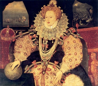
My homage will be to Elizabethan ruffs. For those of you that might not be familiar with the era, Elizabethan ruffs are the massive, wheel-like starched collars that required thousands of pins and a lot of patience to create. One of the more elaborate decorative collars can be seen in the famous Armada portrait. (left).
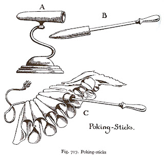
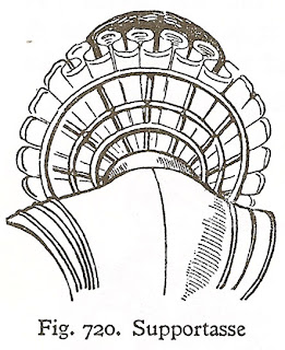


Elizabethan ruffs often required as much as 8 yards of fabric to create. The material was heavily starched and the folds were created with a hot iron called a poking stick, similar to modern curling irons. Figure A. would be heated in the fire and Figure B. would be warmed inside Figure A. Next, the poking stick would be placed inside the starched folds (figure C). The more elaborate ruffs were decorated with lace and bead work and also supported with an object called a Supportasses (Fig. 720). With 8 yards of heavily starched fabric, ruffs must have been extremely heavy. And we complain about high heels!

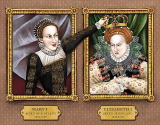
For my next book, The Raucous Royals (due out in September), I wanted to portray Elizabeth in a similar wardrobe as the Armada portrait. This picture introduces the rumor that Mary Queen of Scots plotted to kill her cousin Elizabeth. Elizabeth needed to look regal, but there is just no way that I was going to paint in all that intricate detail in the lace. For fine details like this Elizabethan collar, Adobe Illustrator can make dressing the queen a cinch.

Here are the steps:
  1. I opened Adobe Illustrator and created a single section of the lace work using repetitive shapes and line work. This part is a bit time consuming, but not half as laborious as painting in her whole collar with a really thin brush. Plus, my hand is not that steady and I did want some uniformity in the design.


  2. Once I created one section of her collar, I dragged the entire shape into the brush palate. I selected “pattern brush” for the type of brush. Name your new brush something that makes sense. You now have a new brush created in your brush library.

  3. Next, I created a circle that would roughly be the circumference of Elizabeth’s collar.

  4. Now the magic- select your circle and apple the newly created brush pattern by simply selecting it in the brush library. You should have something that looks like this:


  5. Now select our ruff and hit copy (CTRL/CMD + C) and open Photoshop. We paste the ruff into Photoshop (CTRL/CMD + V) and select “smart object” (we want this to be a smart object so that we can resize it without loosing quality and also have the ability to edit it in the future.)


  6. The next step is to mask out the center of the lace so that it is under the main ruff and encircles her head.

  7. The last step is to apply a “Smart Sharpen” filter under the menu Filter/Sharpen/Smart Sharpen. Lower your fade amount in the highlight area. This last step is in important to force the white and black details to a higher contrast. We need to do this in any shape that is as intricate as this or the pattern will be too blurry.

    Note: We could have also distorted the collar to be smaller in the back and larger in the front, but I liked the flatness of the design in this case.
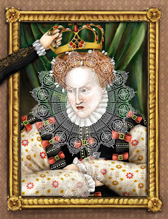
Voila…an intricate lace collar for Elizabeth that would have surely made Mary jealous.

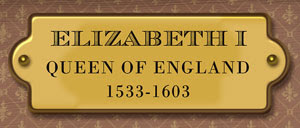
Next week, we reach the pinnacle of pure laziness. I am going to demonstrate how to use the style palate in Photoshop to avoid doing any painting. I used styles to create the gold marker plates. It took 60 seconds instead of hours painting metal reflections and shadows.


Source:
Norris, Herbert. Tudor Costume and Fashion, Dover Publications, Inc. New York, 1997
Picard, Liza. Elizabeth's London, St. Martin's Griffin, New York, 2003

Saturday, March 22, 2008

Illustration Friday: Pet Peeves


This week's topic fits well with a painting that I have been working on. Lately, I feel like my memory is just not working like it used to. Whenever I am introduced to somone, the name just flies out of my head a second later.

So I have been trying this slightly different style....something more abstract and with not as many dark colors. The realism of some of my other work gets a little tedious.

Saturday, March 15, 2008

Illustration Friday: HEAVY

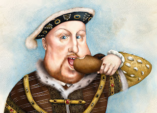
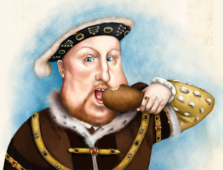
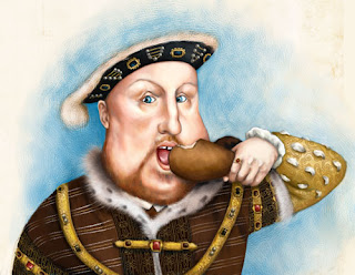
I had a hard time choosing which “heavy” image to post for this week’s Illustration Friday. Sure…the circus fat lady is always a crowd pleaser, but big Babe Ruth has had her time in the limelight. Instead, I thought I would share some very heavy images from my next book, The Raucous Royals. This book is for kids of all ages who hated history. It is history with the juicy bits left in and debunks all the rumors, myths and scandals that have survived through the decades. One of the myths that always fooled me as a kid (and adult) was that Henry VIII was this rotund king storing acorns in his mouth. This image has been ingrained in my mind. Sure, good old Hank was not a looker in his old age, but in his younger day he was quite the ladies man. People from all over talked about his shapely legs and athletic physique. (Legs were especially important in Tudor times. If a guy had nice legs then he was considered a real hottie. Today, I would have to say that legs are the least looked at part of a man’s body.)

So to follow along with the cliché image of big fat Henry, I painted him in this typical eating a turkey leg pose.

Here are some of the stages of the image.


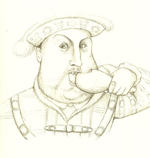
1. Initial Sketch
I first drew a sketch in good old pencil and paper and then scanned it in.


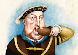
2. Base Colors
I then brought it into Painter and began to flesh out the colors using the Real Bristle Oil brushes. I chose Curled Wood Shavings as my paper to give a slight texture. I hate this stage because it looks very “digital”. I can see those digital gooey paint strokes. (Everyone who has worked with both traditional and digital oils knows what I am talking about)


3. Texture added
At the next stage, I increased the Feature (Found on the top of your screen under the brush controls) of my Real Round Oil brush so that the brush strokes start to show through. Now it is starting to look more like the oil medium. I also at this point added in Henry’s fur collar with the Furry Brush (it is under the Fx brushes). I love the furry brush because I am inherently lazy and the brush creates very realistic looking fur without having to vary the size of your oil brush.


4. Fabric Details
At the next stage, I started to add in all the fabric details on his robe. I love dressing historical figures. For Henry, I researched Tudor fabrics and scanned in the fabric patterns that I planned to use.

Here are the Steps to create the fabric details in the front of his coat.
    1. I scanned in the pattern that I planned to use. You can see an example of the Tudor pattern that I used here.

    2. Next, I opened this scan in Photoshop and used the Levels command to force the dark grey background to black. To do this select Image/Adjustments/Levels and select the black picker (below). Once you have selected the black picker, click on the darkest area of the image. You should see all the dark areas go to black.


    3. This is great but now we need to inverse the image so that all the black areas are white and the white areas are black. To do this, go to Image/Adjustments/Inverse.
    4. Almost there. Now select the whole image (Ctrl/Cmd + A) and go to Edit/Define Brush Preset.

    5. Now we have created a pattern brush that can be “stamped” on to Henry’s robe. Just select our new brush from the list of brushes, create a new layer, and then click once where you want the fabric pattern to go. In this case, I had to do this a few times because he has rows of stitching.
    6. The last step is to bend it to the fold of the clothing using the Warp tool. (Edit/Transform/Warp).

      Voila a royal pattern for our portly king.
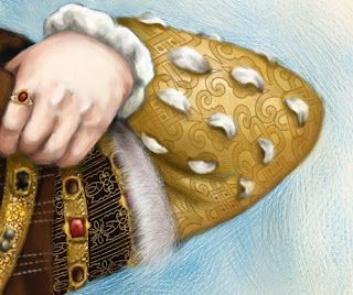
I used the same technique on Henry’s sleeve. Here is an up close detail.

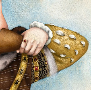
The last step is to create a crackle- like pattern so that it looks like a truly aged oil painting. Here is an up close detail of the crackle affect.


5. Crackle it
To do this, I selected the Square Pastel brush and one of the Crackle papers from Painters list of papers. You want to make sure to choose a contrasting color so that the crackles show through. You also have to make sure the grain is low enough for the pastel to sit on top of the paper. You can find the Grain controls on the top bar. I set mine at 8%. And always do this on another layer so you can take some away if you get a little crackle carried away. This is where I love digital painting because it gives you the freedom to experiment without all those nasty crackle medium fumes.

If you have any technical questions about this process then feel free to email me at info@CarlynBeccia.com. And watch for The Raucous Royals (Houghton Mifflin) in September this year!

Sunday, March 09, 2008

IF: Garden

Here is some wallpaper art that I made a few years ago. I did this one with Painter's impasto and oil brushes on black wood grain. The girl and animals are a bit boring, but I like the look of bright fall colors on black. I might attempt this technique again, but with more interesting characters. It is such a challenge to create depth using only color and size because black flattens everything.

Friday, March 07, 2008

2007 Golden Kite Honor for Picture Book Illustration

I got very good news this week that I have to share with the 3 (ok maybe 4) people who read my blog. I found out that Who put the B in the Ballyhoo? was winner of this year's 2007 Golden Kite Honor for Picture Book Illustration. It's such an honor to be recognized by SCBWI. Check out the winners.

And congratulations to Yuyi Morales for being the Golden Kite winner for Little Night. I was fortunate enough to meet Yuyi a few years ago at the SCBWI Los Angeles conference and she gave me my first ever critique. It was the best one I ever got and Yuyi really inspired me to clean up my act and get a stronger portfolio together.