Friday, April 18, 2008

A Bad Brow Job

As with most people, I love the image of Mona Lisa and her enigmatic smile. But it has always bugged me that the woman is missing eyebrows. I love a good full brow as seen in my header image above. As a child, I used to draw brows on Mona Lisa’s face (still doing it!) Later, I discovered that plucking eyebrows was not in fashion until years after Mona Lisa was painted and I was left wondering…where did her eyebrows go?

Now the mystery of the missing brow line is finally solved. Pascal Cotte, a French engineer and inventor, used a high-definition camera to discover the lost hair in the famous painting. Turns out that good old Mona got over plucked by either the ravages of time or a few overeager attempts to restore her image. You can read more about it here.

Sunday, April 13, 2008

Painting with Style

In this tutorial, I am going to show how to use Photoshop styles to create depth and as a base for your paintings. Styles sort of get a bad rap because most designers and illustrators think of those glass buttons that the mac folks made so popular a few years ago. I remember every client was asking for “glass buttons” during that time and styles started to make me peevish too. But they do have their uses. Photoshop styles helped me whip out the name plate in last week’s tutorial without much fuss.

Here are the steps

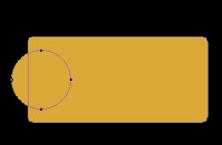
1. Select the rounded rectangle tool from the Photoshop tool palette and set the radius to about 10. Pick some sort of goldish color. Click and drag to make a square with rounded corners.

figure 1
2. Next, we are going to create rounded circles jetting out from the square. Select the eclipse tool in the tool bar. We don’t need to create a separate shape here. It will be much easier to edit as one path. So to do this we will go to the top bar in photoshop and select the compound path option (figure 1)

figure 2


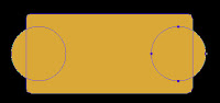
3. Next, hold down the shift key and draw a circle to the left side of our square (figure 2). (holding the shift key constrains the proportions of the circle)

4. Now we obviously want both sides to have the same size circles so we will select the path selection tool (figure 3) and select the circle that we already drew.


figure 3
Hold down first the alt key and then the shift and drag the left circle over to the right.

figure 4


(The alt key makes a duplicate and the shift key makes sure that the second circle is aligned with the first). You will now have one fully editable shape. (figure 4)


5. Now the fun part. We can apply styles to create the depth. Hit the small “f” key at the bottom of your layers palate or double click on the right side of the layer. This opens up the styles palate. Styles are something that you really need to play around with to get the most out of them but I used the following settings for the plate:

Check the following Layer Styles:

figure 5
Drop Shadow:
Opacity 51, set to multiply, distance: 13 Size: 8
Bevel and Emboss: (see figure 5)
Satin: ( see figure 6)
Color Overlay :
Set to orange, Normal blend mode, 100%


figure 6


If you want a rougher metal texture then you may want to play around with the pattern styles too.

And when you are done, in the styles palette, click the small right button and select “save styles” (right). Now you can use it again for creating more metal plates.

Monday, April 07, 2008

New Blog and Site


I have a new blog and site up on gossip and rumors surrounding royal rulers. Check it out and let me know what you think:

The Raucous Royals and the Raucous Blog

Saturday, March 29, 2008

Illustration Friday: Homage


This week’s illustration Friday topic of "homage" could apply to basically anything; music, food, cute animals…dirty socks (I’ve got my growing piles of laundry on my mind). This week I thought I would post a tutorial using Adobe Illustrator because I have not covered any tips in this program.


Elizabethan Ruffs

My homage will be to Elizabethan ruffs. For those of you that might not be familiar with the era, Elizabethan ruffs are the massive, wheel-like starched collars that required thousands of pins and a lot of patience to create. One of the more elaborate decorative collars can be seen in the famous Armada portrait. (left).


Elizabethan ruffs often required as much as 8 yards of fabric to create. The material was heavily starched and the folds were created with a hot iron called a poking stick, similar to modern curling irons. Figure A. would be heated in the fire and Figure B. would be warmed inside Figure A. Next, the poking stick would be placed inside the starched folds (figure C). The more elaborate ruffs were decorated with lace and bead work and also supported with an object called a Supportasses (Fig. 720). With 8 yards of heavily starched fabric, ruffs must have been extremely heavy. And we complain about high heels!

For my next book, The Raucous Royals (due out in September), I wanted to portray Elizabeth in a similar wardrobe as the Armada portrait. This picture introduces the rumor that Mary Queen of Scots plotted to kill her cousin Elizabeth. Elizabeth needed to look regal, but there is just no way that I was going to paint in all that intricate detail in the lace. For fine details like this Elizabethan collar, Adobe Illustrator can make dressing the queen a cinch.

Here are the steps:
  1. I opened Adobe Illustrator and created a single section of the lace work using repetitive shapes and line work. This part is a bit time consuming, but not half as laborious as painting in her whole collar with a really thin brush. Plus, my hand is not that steady and I did want some uniformity in the design.


  2. Once I created one section of her collar, I dragged the entire shape into the brush palate. I selected “pattern brush” for the type of brush. Name your new brush something that makes sense. You now have a new brush created in your brush library.

  3. Next, I created a circle that would roughly be the circumference of Elizabeth’s collar.

  4. Now the magic- select your circle and apple the newly created brush pattern by simply selecting it in the brush library. You should have something that looks like this:


  5. Now select our ruff and hit copy (CTRL/CMD + C) and open Photoshop. We paste the ruff into Photoshop (CTRL/CMD + V) and select “smart object” (we want this to be a smart object so that we can resize it without loosing quality and also have the ability to edit it in the future.)


  6. The next step is to mask out the center of the lace so that it is under the main ruff and encircles her head.

  7. The last step is to apply a “Smart Sharpen” filter under the menu Filter/Sharpen/Smart Sharpen. Lower your fade amount in the highlight area. This last step is in important to force the white and black details to a higher contrast. We need to do this in any shape that is as intricate as this or the pattern will be too blurry.

    Note: We could have also distorted the collar to be smaller in the back and larger in the front, but I liked the flatness of the design in this case.
Voila…an intricate lace collar for Elizabeth that would have surely made Mary jealous.

Next week, we reach the pinnacle of pure laziness. I am going to demonstrate how to use the style palate in Photoshop to avoid doing any painting. I used styles to create the gold marker plates. It took 60 seconds instead of hours painting metal reflections and shadows.


Source:
Norris, Herbert. Tudor Costume and Fashion, Dover Publications, Inc. New York, 1997
Picard, Liza. Elizabeth's London, St. Martin's Griffin, New York, 2003

Saturday, March 22, 2008

Illustration Friday: Pet Peeves


This week's topic fits well with a painting that I have been working on. Lately, I feel like my memory is just not working like it used to. Whenever I am introduced to somone, the name just flies out of my head a second later.

So I have been trying this slightly different style....something more abstract and with not as many dark colors. The realism of some of my other work gets a little tedious.

Saturday, March 15, 2008

Illustration Friday: HEAVY

I had a hard time choosing which “heavy” image to post for this week’s Illustration Friday. Sure…the circus fat lady is always a crowd pleaser, but big Babe Ruth has had her time in the limelight. Instead, I thought I would share some very heavy images from my next book, The Raucous Royals. This book is for kids of all ages who hated history. It is history with the juicy bits left in and debunks all the rumors, myths and scandals that have survived through the decades. One of the myths that always fooled me as a kid (and adult) was that Henry VIII was this rotund king storing acorns in his mouth. This image has been ingrained in my mind. Sure, good old Hank was not a looker in his old age, but in his younger day he was quite the ladies man. People from all over talked about his shapely legs and athletic physique. (Legs were especially important in Tudor times. If a guy had nice legs then he was considered a real hottie. Today, I would have to say that legs are the least looked at part of a man’s body.)

So to follow along with the cliché image of big fat Henry, I painted him in this typical eating a turkey leg pose.

Here are some of the stages of the image.


1. Initial Sketch
I first drew a sketch in good old pencil and paper and then scanned it in.


2. Base Colors
I then brought it into Painter and began to flesh out the colors using the Real Bristle Oil brushes. I chose Curled Wood Shavings as my paper to give a slight texture. I hate this stage because it looks very “digital”. I can see those digital gooey paint strokes. (Everyone who has worked with both traditional and digital oils knows what I am talking about)


3. Texture added
At the next stage, I increased the Feature (Found on the top of your screen under the brush controls) of my Real Round Oil brush so that the brush strokes start to show through. Now it is starting to look more like the oil medium. I also at this point added in Henry’s fur collar with the Furry Brush (it is under the Fx brushes). I love the furry brush because I am inherently lazy and the brush creates very realistic looking fur without having to vary the size of your oil brush.


4. Fabric Details
At the next stage, I started to add in all the fabric details on his robe. I love dressing historical figures. For Henry, I researched Tudor fabrics and scanned in the fabric patterns that I planned to use.

Here are the Steps to create the fabric details in the front of his coat.
    1. I scanned in the pattern that I planned to use. You can see an example of the Tudor pattern that I used here.

    2. Next, I opened this scan in Photoshop and used the Levels command to force the dark grey background to black. To do this select Image/Adjustments/Levels and select the black picker (below). Once you have selected the black picker, click on the darkest area of the image. You should see all the dark areas go to black.


    3. This is great but now we need to inverse the image so that all the black areas are white and the white areas are black. To do this, go to Image/Adjustments/Inverse.
    4. Almost there. Now select the whole image (Ctrl/Cmd + A) and go to Edit/Define Brush Preset.

    5. Now we have created a pattern brush that can be “stamped” on to Henry’s robe. Just select our new brush from the list of brushes, create a new layer, and then click once where you want the fabric pattern to go. In this case, I had to do this a few times because he has rows of stitching.
    6. The last step is to bend it to the fold of the clothing using the Warp tool. (Edit/Transform/Warp).

      Voila a royal pattern for our portly king.
I used the same technique on Henry’s sleeve. Here is an up close detail.

The last step is to create a crackle- like pattern so that it looks like a truly aged oil painting. Here is an up close detail of the crackle affect.


5. Crackle it
To do this, I selected the Square Pastel brush and one of the Crackle papers from Painters list of papers. You want to make sure to choose a contrasting color so that the crackles show through. You also have to make sure the grain is low enough for the pastel to sit on top of the paper. You can find the Grain controls on the top bar. I set mine at 8%. And always do this on another layer so you can take some away if you get a little crackle carried away. This is where I love digital painting because it gives you the freedom to experiment without all those nasty crackle medium fumes.

If you have any technical questions about this process then feel free to email me at info@CarlynBeccia.com. And watch for The Raucous Royals (Houghton Mifflin) in September this year!

Sunday, March 09, 2008

IF: Garden

Here is some wallpaper art that I made a few years ago. I did this one with Painter's impasto and oil brushes on black wood grain. The girl and animals are a bit boring, but I like the look of bright fall colors on black. I might attempt this technique again, but with more interesting characters. It is such a challenge to create depth using only color and size because black flattens everything.

Friday, March 07, 2008

2007 Golden Kite Honor for Picture Book Illustration

I got very good news this week that I have to share with the 3 (ok maybe 4) people who read my blog. I found out that Who put the B in the Ballyhoo? was winner of this year's 2007 Golden Kite Honor for Picture Book Illustration. It's such an honor to be recognized by SCBWI. Check out the winners.

And congratulations to Yuyi Morales for being the Golden Kite winner for Little Night. I was fortunate enough to meet Yuyi a few years ago at the SCBWI Los Angeles conference and she gave me my first ever critique. It was the best one I ever got and Yuyi really inspired me to clean up my act and get a stronger portfolio together.

Tuesday, February 26, 2008

Multiples: Daisey and Violet Hilton

I thought I would participate in my first ever illustration friday post with the topic of multiples. This painting of Daisey and Violet Hilton is one of my favorites from my book. Throughout their lives, Daisey and Violet attracted drama times two. Together they went through marriages, divorces, business failures and even had brief stints as Hollywood stars.

Daisey and Violet were born in England in 1908. Born as conjoined twins, they were attached to the hip and buttocks. They toured as sideshow acts from the age of 3 but our best known for their roles in the movies Freaks and Chained for Life. (Freaks was panned by critics and Chained for Life was banned in many places due to its content. )

Their marriages were about as successful as their movie careers. Daisey was married to vaudeville dancer Harold Estep for an everlasting two weeks. And Violet married her dance partner, James Walker "Jim" Moore, but got divorced a few years later.

In 1952, the Hilton twins opened a hamburger stand called The Hilton Sisters' Snack Bar. But that too was doomed to failure for people did not want to be served food by two "freaks". Sadly, the two sisters died penniless in their trailer from the Hong kong Flu.

Thus, I have painted the Hilton twins as two grumpy, young brats gravely unhappy with their role as side show novelty acts.

Here is a far more cheery vaudeville poster advertising their act as young girls. As mentioned in my book, they sang, dance and played instruments as part of their show.

Source:
Taylor, James & Hotcher, Kathleen. Shocked and Amazed! On and Off the Midway. The Lyons Press, 2002

Saturday, June 02, 2007

Ballyhoo Tip of the week….ok maybe for the next few weeks

I have been trying to get in the habit of posting a digital painting or writing tip each week. But what is that saying about the road to hell….something about it paved with good intentions? Every week might just be a little too ambitious with my schedule.


So here is the tip for this week…

Many of you have probably already upgraded to the new Painter X And if you have not then here is one of my favorite new features. It is called the Divine Proportion tool.
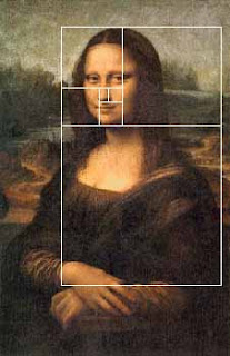
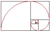
Divine proportion in art is sometimes referred to as the Golden Proportion, Golden Number or if you are a real geek, the Fibonacci Series. The golden number is basically 1.6180339887 otherwise known as phi. Inside of the big rectangle is another rectangle that has an exact ratio of 1:1.618. Inside of that rectangle is another rectangle with a perfect ratio of 1:1.618. Probably the most famous example of The Golden Ratio used in art is Leonardo's Mona Lisa The Golden Ratio can be found in Mona Lisa’s enigmatic face. Shown here:

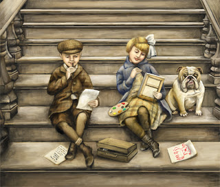
I have always been fascinated with the idea of Math in art and always try to be aware of planning a composition so that that main action does not fall into a dead zone. The example above is the art I created for the 2007 SCBWI Publication Guide. (available to members at www.scbwi.org) Because this art was created to fit into a small space, I am going to use the divine proportion tool from edge to edge.

Here are the steps:

Step 1: Go to Window/Show Divine Proportion. The tool’s interface with look like this:
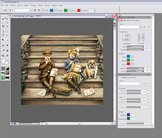

Step 2: Check the box for “Enable Divine Proportion” at the very top.

Step 3: You can now alter your Divine Proportion tool to match your composition. In this example, I selected a vertical orientation for my divine proportion because I want the eye to be carried up the stairs but the focus to be on the little girl’s expression. (In my original sketch she did not fall in this location so I moved her.

Here is an example with the image screened back so you can better see it:
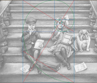

You can also change the rotation and the scale of the divine proportion by tinkering with the controls below the orientation. In most cases, you will not want your divine proportion to go from edge to edge. This image is postcard size and there is not a lot of empty space so the viewer takes the whole thing in at once. In a larger painting this will not be the case.

So of course, I started to wonder if other artists use Divine Proportion in their art. Here is an illustration from the super talented Loren Long and a good example of when you would move the Divine proportion tool.
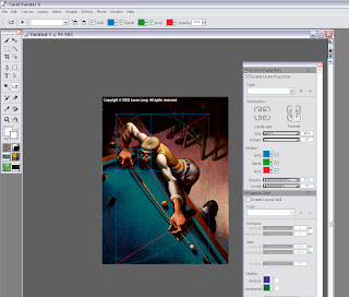
In this painting the viewer would not take in the dark space in the back. It is intentional dead space – sort of like an area for the viewer to rest before they take in the main action. In music, we would call it the build up. So if you move the Divine Proportion tool to encompass only the man then you will see that it falls perfectly into a golden ration.

You move the Divine Proportion tool by selecting it in your main tool bar. It looks like this: When you move your cursor over your painting, your cursor will turn into a hand so you can position your Divine Proportion guides manually.

In Loren's painting, the first main rectangle encompasses the sweeping motion. The second rectangle encompasses the perfect hand to elbow to face ratio, and then the smaller rectangles encompass the concentrated look on the man’s face.

The composition is perfectly planed. Now let’s take a moment to hate him, but I suspect that Loren is not conscientiously aware of the math behind his art. Most artists do this naturally. For the rest of us….there’s the Divine Proportion tool. Loren has a New Book out now that is stunning as always.

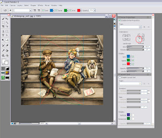
But if all of this makes your head hurt then there is also the good old rule of thirds to go by. In the box below the Divine Proportion tool there is an option to turn on a layout grid. The layout grid will at least tell you if your main action is falling into the thirds of your painting. You can find this option here:

If you would like to learn more about how Math works in art then I recommend Rhythmic Form in Art by Irma A. Richter

I hope this tips help. If anyone is interested in how to do the same steps in Photoshop (not quite as easy) then please comment below and I will make that next week’s tutorial.

Monday, May 21, 2007

Digital Painting - Conference Notes

Thank you to everyone who came to my class on Digital Painting. I know the experience level of the attendees ranged from computer shy to expert but hopefuly everyone got something out of it.

For anyone who did not get the conference handouts, I have a link where you can download them here:

http://www.carlynbeccia.com/blog/notes.pdf

I know I also said that I would post the goodies cd. Well....I have a terrible habit of leaving something wherever I go. (I go through about 12 pairs of gloves a winter) After the conference, I left a small blue case which had 3 small portable hard drives. One of those hard drives contained the goodies material. You would think I would have this on my computer right? I do, but not in the organized fashion that I did on those portable hard drives.

So if anyone found a small blue case, PLEASE email me (info@carlynbeccia.com) because I am dreading having to reorganize everything again.

Wednesday, May 09, 2007

More Ballyhooed Books


I was so happy to finally get ABC Safari By Karen Lee in the mail today. I love ABC books but this one is really stunning! Each letter introduces a new exotic creature from the jungle in beautifully rendered (I think) watercolors. The way Karen paints is sort of like soft cubism where each animal is built up with washes of transparent color.
My favorite is of course the Vulture under V but those of you with less macabre taste may be more drawn to the cheetah that leaps off the page or the angelic looking ape cradling a flower.

My nephew's favorite restaurant is the Rainforest Cafe because of all the wild animals. Next time he asks to go there, I can avoid their very nasty food by bribing him with this book!

Wednesday, May 02, 2007

A Ballyhooed Book

5 book signings, 3 library visits and 8 school visits….in 3 weeks! I have not even had a chance to announce the release of my first book, Who put the B in the Ballyhoo? It’s been said that your first book is like a having a baby, so as a proud parent I couldn’t resist taking a much needed breath to talk about the aspects of the book that I am most proud of.

People have asked me many times how I researched the book. The short answer is that I poured over hundreds of circus posters, placards and broadsides to match the language and style of vintage circus posters. Then, I dug deeper to uncover the history behind these unbelievably talented circus stars. For those that love circus lore you will be familiar with many of the phrases in the book such as “Starling and Stupendous”, “Combined Shows” “New acts that Amaze and Delight” and my personal favorite, “Important Engagement” (It sounds deliciously Victorian!)

But after reading the book to over a 1000 kids this month, I am also proud of the sidebars that give a glimpse of circus life without giving so much detail that the reader’s attention span is lost. Each sidebar has about 3- 4 lines of fascinating factoids about some of the circus’s most celebrated stars. When I first took on this book, I was not convinced it was necessary. I thought kids couldn’t possible care about how much weight Louis Cyr could lift. Luckily, my always wise editor convinced me that it would add another layer to the book. I now find kids are actually far more interested in these factoids than even the art.

But sometimes the things that we are most proud of are not the ones that your critics and readers embrace. They are the private passions that only the artist or author could possibly care about. For me, that passion is the typography and design elements that give each page its own character. I have been a designer for over 10 year now and typography is in my blood. My grandfather set the type for his hardware store. I still have his Speedball books that show the careful way that he traced every letterform and still smell of his favorite tobacco. I know kids, adults and certainly book critics could care less whether I used a decorative art nouveau font or the bolder, 19th century slab type that reflected a nation facing industrialization and the rise of the emerging advertising genre. (yawn) And no, I never point out to kids how some pages have type with bracketed serifs that later evolved to letterforms of contrasting weight popular at the turn of the 20th century. I can just picture their eyes glazing over. People whom have seen the book always comment on how different each page looks.

I never met my grandfather, but I know he would have been proud.

Thursday, February 15, 2007

New study suggests praise hurts your child's development.

Oh you're so smart! You're so talented!

A gold star for you! We all love to hear praise. It is the main staple of our egos and we certainly don't hold back feeding our kids a daily diet of “your so wonderful.” But a new study suggests that praise is more junk food than food for thought. So why do we feed our children praise? Ostensibly, we praise them so they will keep on trying and approach challenges in life with confidence. Makes sense, right? Wrong, according to a study by psychologist Carol Dweck. The study found labeling your child “smart” actually causes them to try less!

In this study conducted at a dozen New York schools, two groups of 5th grade students were given the same nonverbal test, but each group was rewarded with very different types of praise. The first group was told, “You must be smart at this.” The second group was told, “You must have worked really hard.” Researchers then challenged both groups to take another test in which the students could choose either a harder or an easier test. 90% of the group that was praised for their effort chose the harder test. The kids who had already been labeled smart took the easier route. According to Dweck the reason is simple. Dwecks says, “emphasizing effort gives a child a variable that they can control. Emphasizing natural intelligence takes it out of the child's control, and it provides no good recipe for responding to a failure.” Read more.

I was really encouraged to read this study because it ties directly into the theme of my language arts presentations that I am giving at schools in April - June. I have my box of tricks prepared to created mnemonic devices for all the tough vocabulary in my book. I have also planned silly drawings of the brain and its many nerve endings. My goal is to show how vocabulary is built by making connections in the brain and not something that you are born with. It was only until fairly recently that scientists discovered that we really do grow our brains.


New study suggests praise hurts kids’ development.

When I was a teen, I asked my father why I had to go to college. (I was going through this artsy ego-centric phase where I believed I was plenty smart enough.) My father replied in two words, “Mental Gymnastics”. Use it or lose it was my dad's wisdom and I always liked to be challenged. Kids need to understand that they are in control of becoming stronger readers. And just like building the muscles in your biceps, or playing a sport, building vocabulary can be fun if you make it into a game. It's a brain game. But it does require some hard work and a lot of heavy lifting.

To book an author visit at your school. Contact Carlyn's booking agent, Susan Katz at KatzConnects.

Monday, February 05, 2007

PROJECT CICERO needs books!

Can you imagine growing up without books? I certainly can't. Books were my escape from the world around me. So please support Project CICERO this month.

PROJECT CICERO (www.projectcicero.org) is a partnership of independent, public, and parochial schools, private and public organizations and corporations whose primary goal is to supplement or create classroom and school libraries for children in under-resourced New York City public schools through an annual citywide book drive. PROJECT CICERO also puts books into homeless shelters, juvenile detention facilities, community centers, and wherever else there is a need. This past year, its sixth year of operation, PROJECT CICERO distributed 125,000 books. To date, PROJECT CICERO has placed 800,000 books into 4,500 classrooms and school libraries reaching 150,000 children in under-resourced schools in New York City.

PROJECT CICERO collects new and gently used books for children and young adults. Books must be in new or excellent condition. Most needed are early readers through teenage fiction and all non-fiction (including biographies and science), both hardcover and paperback. Picture books are also welcome. Non–fiction and reference materials should not be more than five years old. PROJECT CICERO does not accept discards from school libraries, textbooks or books for adults.

Books can be sent to this address:
PROJECT CICERO
53 East 79th Street
New York, NY 10021

Tuesday, January 09, 2007

OFF WITH THE HEAD OF THIS GREAT QUEEN OF SCOTLAND


I have been struggling with creative (yet not too grisly) ways to show Mary Queen of Scots’s execution. Now, I am not saying being an executioner is easy with that whole black mask on your head and angry fishwives yelling at you, but Mary’s executioner really botched the job. It took three swings. Ouch. Two I can understand. But three makes you an Executioner School Drop Out.

Here is a sneak peek at a new painting. The illustration is for my next book, titled Royal Raucous, The True and Untrue Rumors of Royalty due to be release in 2008, Houghton Mifflin. I refer to it as tabloid magazine meets history lesson. I am shameless. I will pull any trick to make history fun for kids. Even grosse tricks. I want this book to be a gateway drug to history. Stand back Paris Hilton! Kids may think your life is exciting, but they never read about Mary the Stuart Drama Queen and the rumors that became her downfall.

Speaking of drama….tick tock. The dummy is due in two weeks and I have one area that I have been really struggling with. It’s the subtitle. It’s too long and I am not sure if it accurately describes the book. Wait a minute... I realize what is wrong with it. I have done it again. The Deadly Disease of the “OF” has struck my innocent story…of Mary. Make it stop.

I think I have Grammar Disease of the OF. of is word vomit. It even spews out of my mouth every time I sit down to type the blog of the month. Ugh . Isn’t it much clearer to write this month’s blog? Which brings me to my useless tip for the month…..

Off with the “of”. If any writers have stumbled on this blog, then I know you are shaking your head saying, “I never abuse the “of”. fess up OF junkies! We all abuse the “of”. So in memory of the great head of Mary Queen of Scots. OFF with her OF!

I want to thank Edna (http://www2.blogger.com/profile/12709772808838891790) for suggesting that I call my platform for Who put the B in the Ballyhoo? “circus artistry”. I like it. I have been calling it the “art of the circus poster”. I will never learn.

Thursday, October 19, 2006

Someone give that Little Person a Platform


I keep hearing that authors should have a "platform". If you write a book about a beagle then you better be the president of the beagle society. Writing a book about Egyptian excavation? Well, you better spend your free time mummifying your relatives. I generally ignore buzz words unless they make me feel inadequate. This one makes my 5.6 (with favorite heels on) self feel especially short.

My next book, Who put the B in the Ballyhoo? is about the circus. I can't juggle, I am terrified of clowns, and my last name doesn't end with Barnum or Bailey. What's a circus-loving girl to do without a platform?

I know my publisher realized that I didn't have a platform before they signed the book. I was not at the acquisition meeting, but my active imagination has vividly recreated it:

Publisher: what is this author's platform? (publisher has that delighted "I just used an industry buzz word" look)
Editor: Well, I believe her third cousin, twice removed, trained big cats until an unfortunate incident with a hungry Bengal tiger. Oh, and she can paint.
Publisher: hmmm...can she perform any circus tricks?
Editor: um well no...no wait.. I think she mentioned a hidden sword swallowing talent. She is also very handy with a paint brush!
Publisher: Will she swallow swords to sell books?
Editor: I could certainly ask.
Publisher: well, if she will swallow swords then sign her up. And if not, then maybe we could count on that painting thing.

And there you have it. A sad tale of a midget circus girl with a lonely paint brush and no circus tricks. What will be her book's fate????? (insert dramatic organ music here)

Someone out there give me some ideas, hope, sage advice, or maybe just a stepping stool. How do you promote a book without a platform?

Monday, May 15, 2006

THE POD PEOPLE: A LOVE STORY


For the last three years, I have been having a secret love affair. We first met in my art studio behind easels and freshly stretched canvases. Our tumultuous love affair was frustrating but always exciting. At a recent SCBWI conference, I decided it was time to stop hiding and go public with our affair. It was time to say the three little words that would forever change our relationship. So armed with the liquid courage of two vodka tonics, I blurted out the brave declaration of my undying love. "I work digitally".

As soon as I said it, I felt the scarlet D burning through my SCBWI nametag. Everyone would know my dirty secret now. No, the paintings were not created with a mixture of blood, sweat, tears and India ink. No, I didn't stay up late with the smell of turpentine burning my nostrils and destroying the logical side of my brain. Instead, I sat in an ergonomically correct office chair equipped with my pressure sensitive tablet and my most beloved of all...James my computer.

James the Butler is his full name. I christened James with this name because he cost so much that I truly believed he would do laundry, wash dishes, and on occasion split DNA.

We are a scorned pair. I heard many negative remarks about digital artists while at the conference. One very talented artist commented that the only tool he used to create his work was his "hand". Ouch. The implication was understood. It is true. Digital artists sprout tentacles when in contact with their computers. Their eyeballs pop out of their head along with some stale smelling slime that spawns what we call "digital art".

Why is digital art viewed as such a detached way to create art? James has yet to create a single piece of art without the help of my "hand". Maybe it is because there is a lot of bad digital art? But there are also some equally scary watercolors, oil painting, and pastels floating around. (Aunt Elma this is not directed at you...your watercolor lighthouses are beautiful) Maybe it is just that digital art is misunderstood? Maybe we just need some understanding of why so many artists mix a little computer into their oils. Here are some of the finer points that keep James and me together.

1. If I had to do it all over again...
Imagine having the power to go back in time and undo mistakes. Splash some red on that tree. Go ahead...you can always undo it with two clicks. You now have the power of "control z" at your fingertips. Control Z that extra bunny. Control Z that mustache. Control Z that experimental use of black. Control Z your college boyfriend. Ok maybe not that.

2. No messy endings
I was always a messy painter. Half of my painting would end up on the white sofa. Not any more. Now, I clean up with just one click of a button. So in some ways, James does save on cleaning bills.

3. Love Hurts
It was my junior year in college, when I came home to my roommate cutting her boyfriend's head out of a picture. If she had owned Photoshop, she could have not only cut out his head, without the use of a sharp object, but also replaced it with her new boyfriend...Brad Pitt. Today's digital artists are doing something similar to my roommate's lobotomized memories. Composition is a large part of whether a painting works and the ability to easily rearrange, scale, rotate and even distort objects in space can only create a stronger composition.

These are just some of the top reasons why I use a computer. But it is not the tool that creates a great painting. It is the artist. So if you are a traditional artist, be kind to a digital artist's strange taste in partners. Our tentacles can reach far when angered.

Monday, May 01, 2006

The Fiji Mermaid

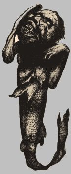
Here is the rare and beautiful Fiji Mermaid captured from the Fiji islands:

I had the opportunity to see one of these creatures in the Dime Museum in Baltimore, MD. It looked like this:

Although it certainly is an interesting tale, The Fiji Mermaid was actually captured from one of P.T, Barnum’s skilled taxidermist. Barnum paid his taxidermist to sew a fish tail on to an orangutan’s torso and voila the Fiji mermaid was born. To read more about the Fiji Mermaid and other famous circus stars, you will have to wait for the book titled Who Put the B in the Ballyhoo being released in May of 2007.